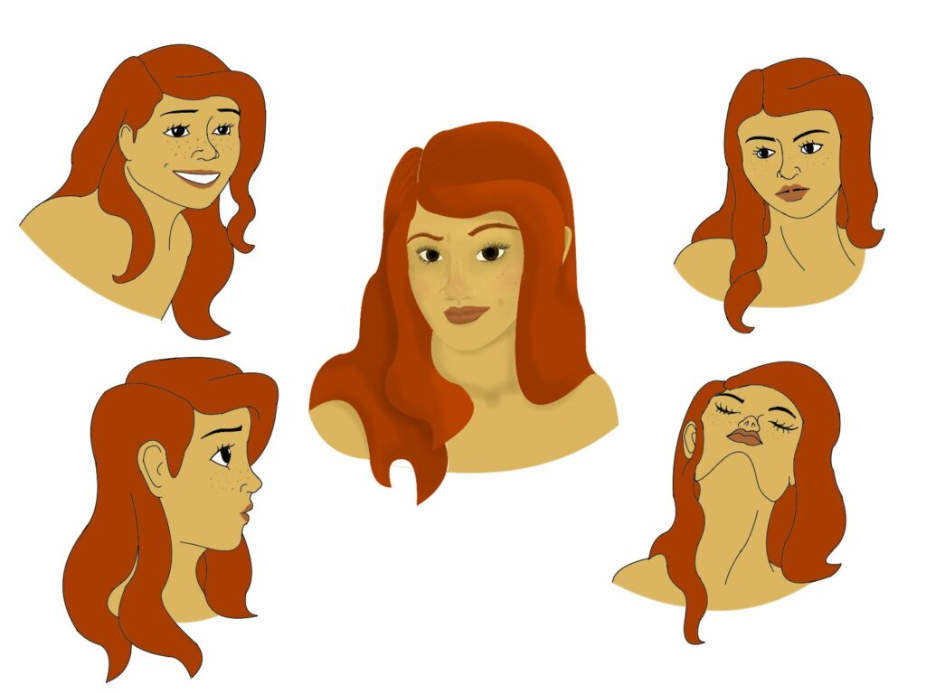
I’ve really enjoyed getting to colour in a character this week. While the outside four faces were simply flatted in (added using the filler tool without any shading or gradients) the face in the center is a lineless style incorporating lighting, shading, blending, and different hues. Though the central image took twice as long as all the others combined to colour in, it is definitely my favourite. I’m glad to have experimented with both styles, as both the simple flats and more complex style can be used in different situations. I would definitely use the simple, flat style when creating character designs or artwork for a specific purpose, but if creating a piece just for the sake of the art itself, I would want to be more detailed and complex to add depth to the piece.

Leave a Reply